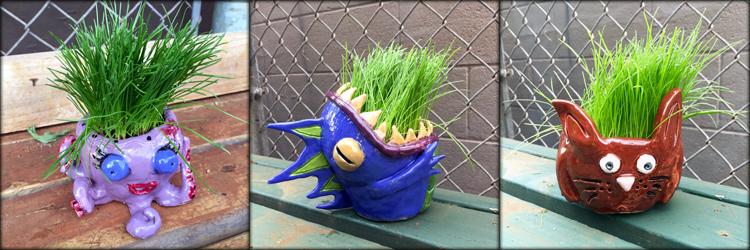
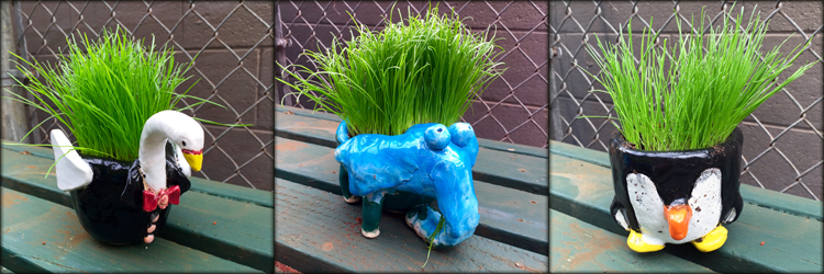
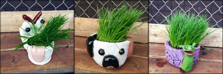
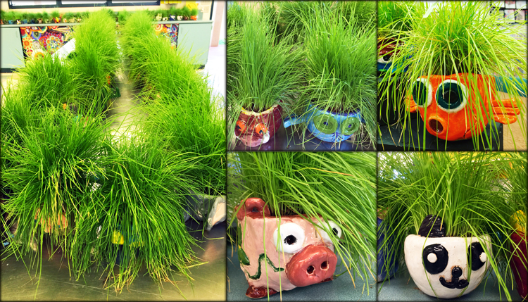
Pet Planters
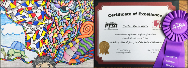
PTSA Reflections Art Contest
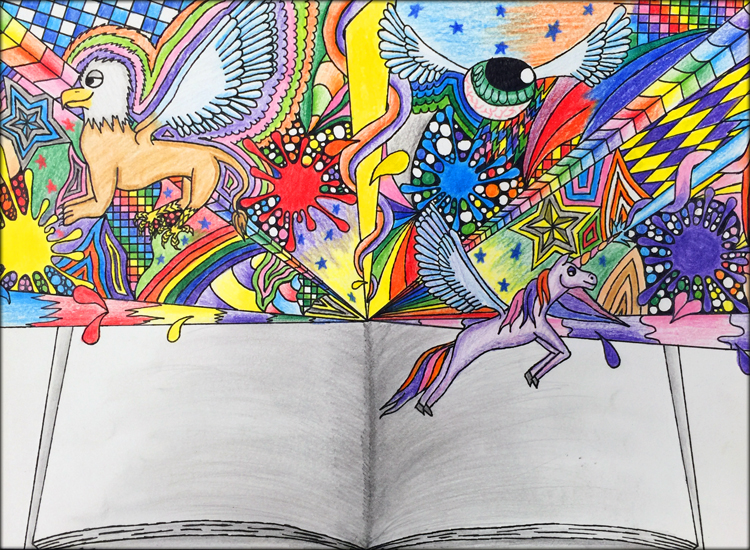

“My artwork was partially inspired by our watercolor work in my art class. We had made watercolor landscapes and that dream-like look inspired me to use that medium in my artwork. I was also somewhat inspired by the name of the contest itself – the name “Let Your Imagination Fly” automatically put images of birds in my mind, and then the whole idea came together.”CLICK HERE to read more of Arianna White’s artist statement…
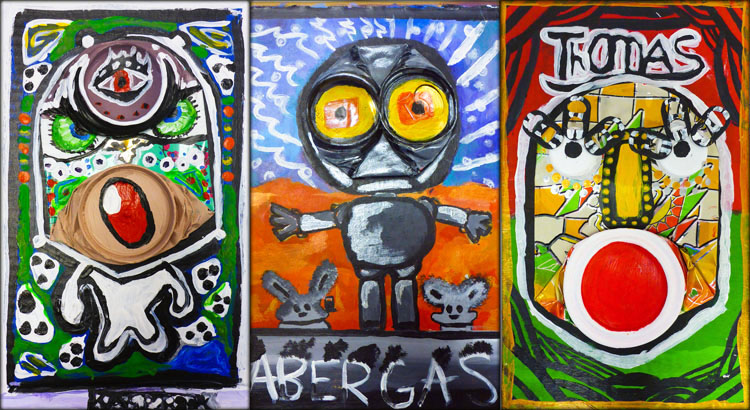
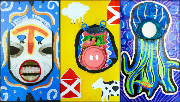
This year’s recycled art project involved smashing soda cans, reusing cardboard boxes and transforming the combined pieces into a unique work of art. Students explored the contemporary work of French artist Didier Triglia, before coming up with their own original designs based on his style and techniques.
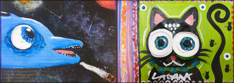
Lots of sketchbook work and planning helped students to envision how they might transform the irregular 3-dimensional form of a crushed soda can into something new. Next came their favorite part of smashing the cans! After my first period made a noisy racket, I got smart and required that students do the smashing part outside.
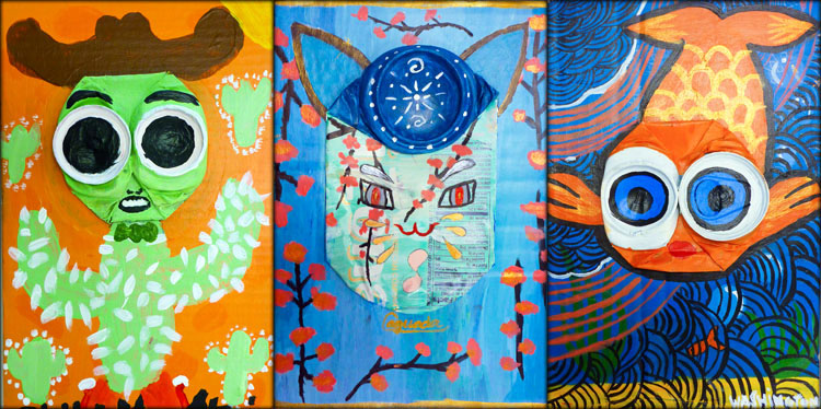
Some students chose to reveal parts of the original can label within their design, while others covered up all the aluminum with acrylic paint. Do you see where the can is in each composition?
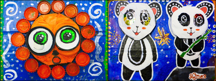
The background of each artwork includes heavy pattern, outlines and borders. Many students also incorporated extra can tabs, bottle caps and other recycled material.
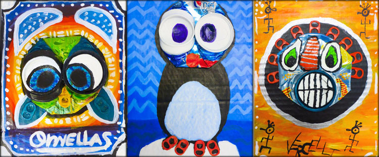
An article titled 11 Artists Doing Amazing Things With Recycled Materials by Jill Harness complemented this lesson by exposing students to other styles, materials, and ideas.

Finally, we looked at portraiture from one of the most influential artists of the 20th Century- Pablo Picasso. Students readily identified stylistic comparisons between Didier Triglia’s “can heads” and Picasso’s stylized and abstract faces.
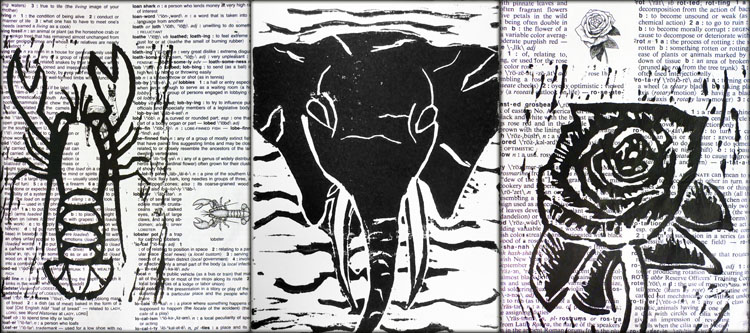
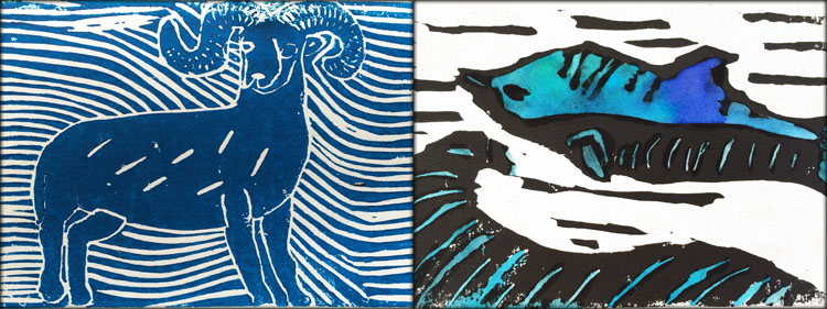
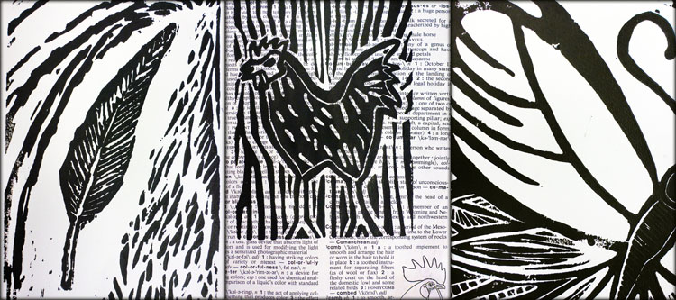
Old discarded dictionary pages served as the inspiration for these linoleum block prints. Students searched through torn out pages for words, definitions, and images to influence and inform their designs. Students also studied the works of printing masters, Albrecht Durer and Katsushika Hokusai as models of skill and innovation.
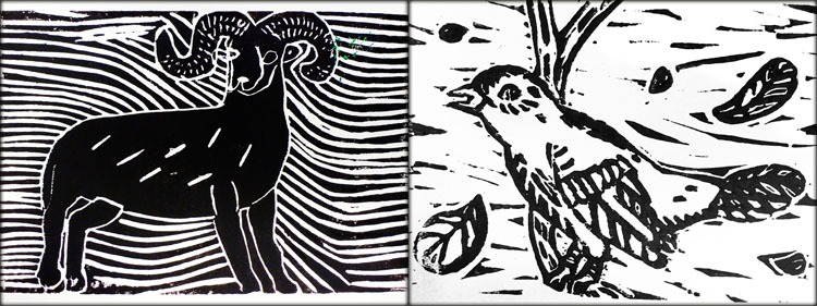
The process involved drawing, transferring, and carving a linoleum block before printing several copies of the image. Students printed water based ink on a variety of media including the original dictionary page that inspired their image. Other media included thick white drawing paper, colored papers, and greeting cards.
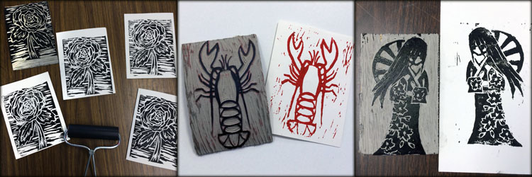
After the first printing session with only black ink, students experimented with different ink colors set up in stations around the classroom. With any time left over, they also added liquid watercolor paint to enhance some of their finished prints.
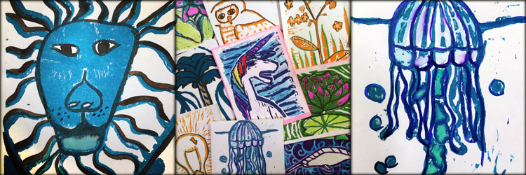
Part of the fun was trading images once enough copies were made. Many students were willing to share their prints, and took home a “variety pack” of greeting cards to use for special occasions.
Finally, we created origami envelopes sized to fit the printed greeting cards. Each student donated two greeting cards with envelopes to sell as a fundraiser at our Elective Family Night! Thank you to all who purchased our handmade cards in support of our Art program!
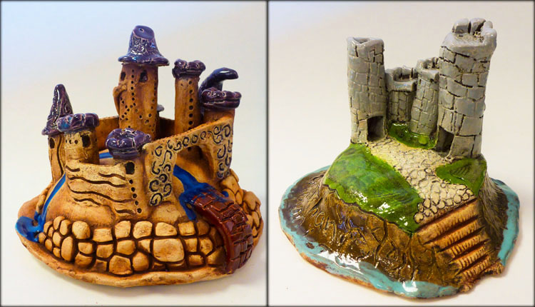
What could be more whimsical than a hand-crafted miniature castle? After studying medieval castle architecture, terminology and function, students came up with their own creative designs.
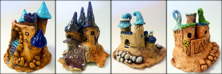
Beginning with clay slabs draped over newspaper armatures, each student created a “motte,” or earthwork mound on which to build their castle. Next they constructed a number of cylinders that would become tower structures with spires or crenelation at the top. Most of the castle pieces were built using slab construction to maintain hollow forms.
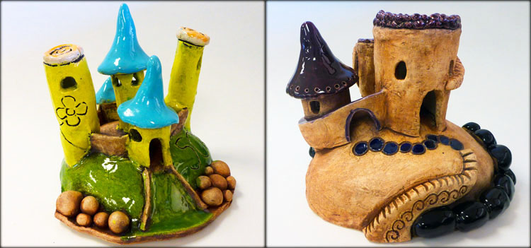
Once the towers were formed and attached, students carved out windows and doors and added stone or brick texture. Walls and walkways connect the towers and allow the viewer’s eye to wander through the sculpture, going in and out of doors, across bridges, and up winding staircases.

Although students started off with a general plan mapped out in their sketchbooks, the process took on an organic and spontaneous nature. Generally students worked from the center moving outward, adding details and improvising along the way. A final detail included each student’s family crest (or last name) carved into the wall of the castle.
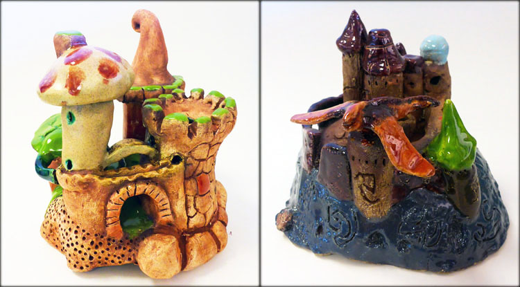
After bisque firing, the castles were finished with an iron oxide stain and the addition of selective glaze colors. The reddish-brown stain creates an earthy natural look and highlights texture by creating contrast. The limited color palette enhances unity and allows students to experience the magical glaze transformation that happens during firing.
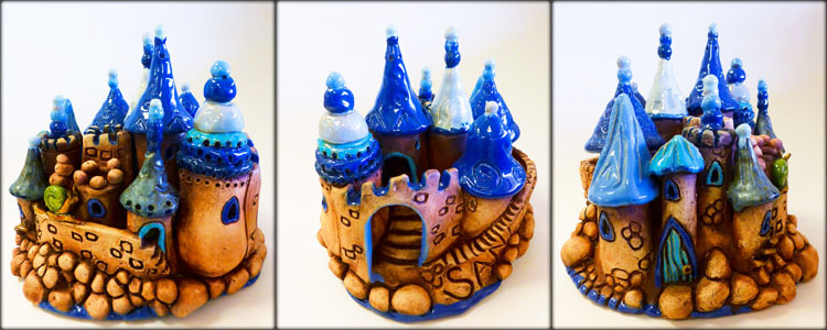
The three views of my example above shows a variety of sculptural detail that can only be witnessed by moving around the castle and looking from all sides. While the photos can show the general idea, these creative artworks are best viewed in person!

This tile project was made possible by a generous donation from local ceramic artist, Nanette Butler. After retiring from her tile business, Agape-Aloha Isle Tiles of Hawaii, Nanette decided to share everything from bisqued tiles, colorful glazes, kiln furniture and even shelving with our school.
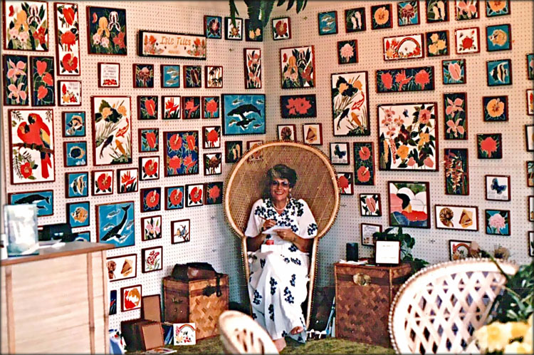
Pictured above is the artist in her shop, surrounded by all of her vibrant artwork. Mahalo nui loa, Nanette, for providing us with such high quality ceramic supplies and this amazing opportunity!

The floral and plant designs for this project were inspired by the Garden Isle’s tropical foliage along with Art Nouveau style from the late 19th and early 20th centuries.

The history of ceramic tile is ancient, involving utilitarian uses along with regional and cultural decorative styles that span the globe. Art Nouveau tiles happen to be one of my personal favorite styles that also was easily adapted for our Hawaiian plant designs.

After several practice thumbnail drawings in their sketchbooks, students selected a flower or plant of their choice for a final design. Some popular designs included plumeria, hibiscus, haleconia, lotus, orchids, monstera and taro.

Students imitated Art Nouveau style by simplifying shapes, integrating curvy “whiplash” lines, adding a border or frame and making their designs symmetrical. Before applying glaze, a thin layer of wax resist was applied to all lines to create a white outline. Finally, a minimum of 4 glaze colors were applied to all unwaxed surfaces before the final glaze firing.

Each student brought home an original tile that can serve a variety of purposes. It can be used to protect furniture from a hot serving dish or glass, or it might be incorporated into a tile wall or backsplash as a feature design. Some may simply want to display it on a shelf for aesthetic enjoyment.
Thanks to Nannette, we still have some leftover tiles that I plan on using for a more collaborative project in the near future. Maybe a tile mural for our classroom is on the horizon!
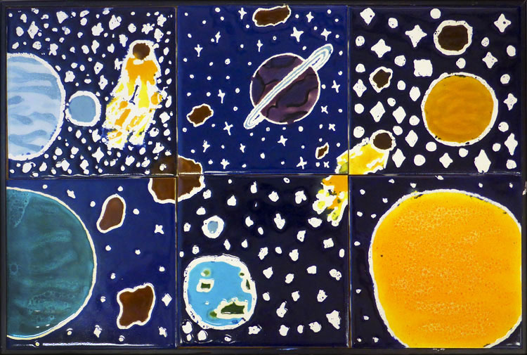
The collaborative design above was created by six ambitious eighth grade students who had some extra time in class. They worked out the overall “outer space” composition together, and then each glazed her own tile. This will be an inspirational example for next year’s project!
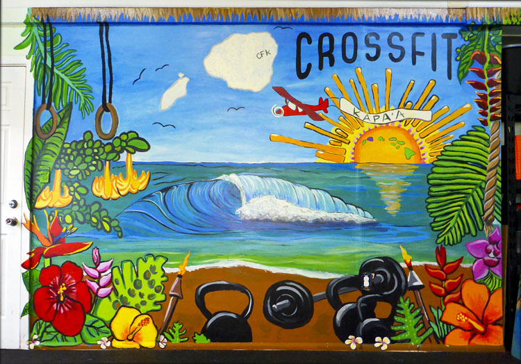
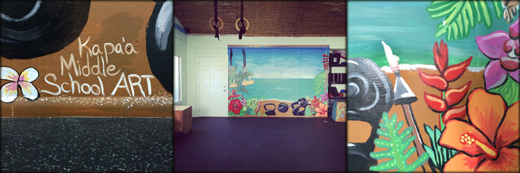
Kapaa Middle School art students contributed their talents by designing and painting a mural for local business, Crossfit Kapa’a. Business owner and coach, Charlotte Psailla, visited our class to talk about health, fitness, and propose her ideas for a mural.

Students were challenged to design an image that captures the essence of Kauai’s Eastside beauty, Crossfit-style fitness, and the company’s logo. They worked in teams to generate ideas and sketch rough drafts which were later reviewed, revised and refined. The final image is a combination of the best elements from each group’s proposal.
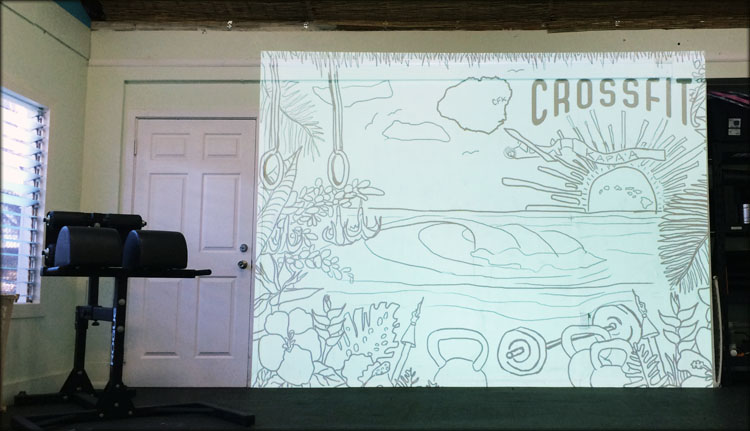
For an accurate enlargement, we projected a black and white version of the design on the wall while students painted. Beginning with underpainting and background colors, layers of color and details were added over several painting sessions. Dedicated student volunteers gave weekend hours to help complete the painting.
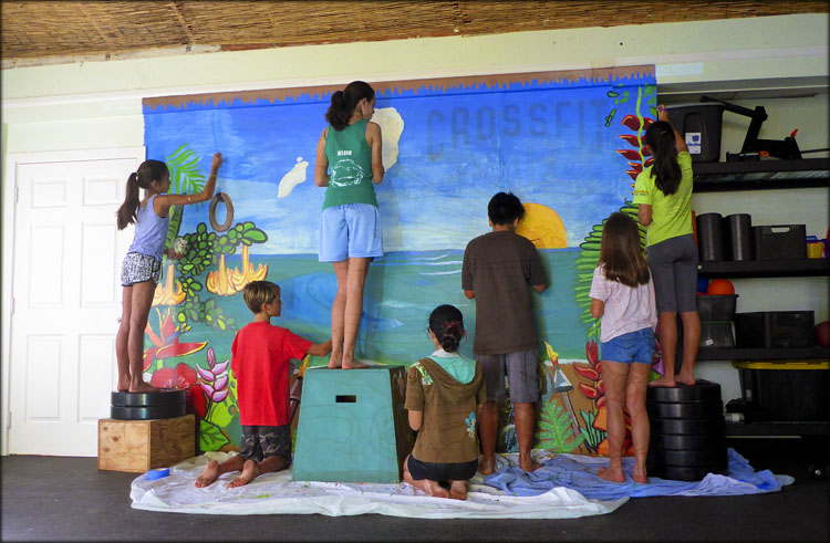
Student volunteers were awarded with 4 sessions of free Crossfit Teens classes. Their efforts were also celebrated during a final “mural unveiling” party with all of the Crossfit community. This was a fantastic real-world application and service learning opportunity for Kapa’a Middle School art students. Thank you Crossfit Kapa’a for partnering with our students, and for your mission “To help Kauai’s residents and visitors alike enjoy the highest level of functional fitness through a supportive community, top quality coaching, and a safe facility.”
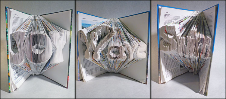
The addition of a new 7th period literacy-focused class to my schedule inspired this folded book project. Luckily I had freedom to interpret the meaning of “Literacy” for myself and design my own Art-based curriculum. For our first project, each student folded a 3 to 4 letter word, and then wrote a blog post to explain the artistic process and choices.

Drawing inspiration from artist Isaac Salazar, students brainstormed a list of inspiring words. Many also selected a word that related specifically to reading, books, or learning. We discussed how certain books (specifically encyclopedias) are now being replaced with tablets and online technology. What better way to recycle old obsolete books than to transform them into a new sculptural art form?
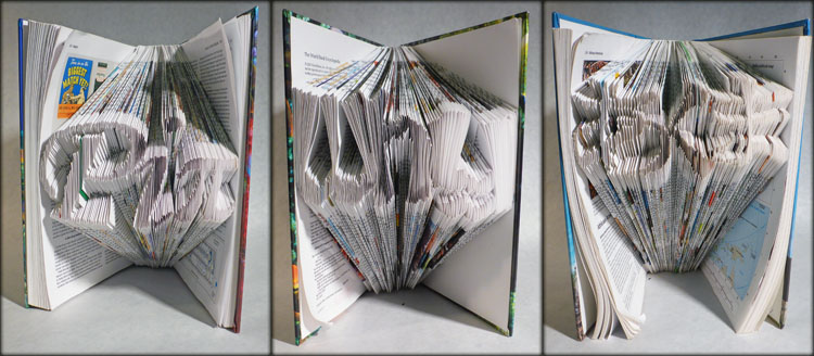
Our school librarian donated a two sets of old encyclopedias for our project that worked perfectly! It helps to have a sturdy hard cover and lots of pages for folding, and I’m happy that these discards won’t be added to Kauai’s growing landfill.
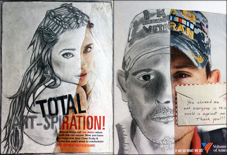
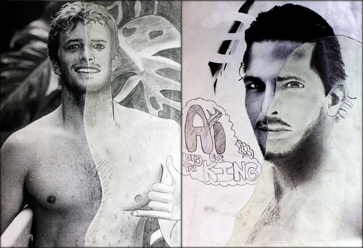
This lesson was so successful the first time, that I decided to bring it back again this year as an introduction to drawing the human face. First students practiced and developed skills to identify and map out guidelines for correct facial proportions. Next they learned shading techniques to create values ranging from the darkest shadows to the brightest highlights. All of this was done with a regular #2 pencil!
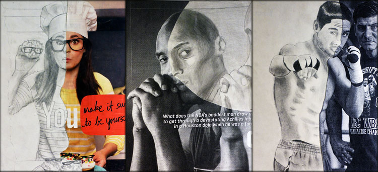
Portraits were selected from magazines and cut so that students had to draw at least half of the face. The original picture was also limited to the torso or shoulders up (no full body images), and needed to fill the whole page. This allowed students to focus on drawing the face.
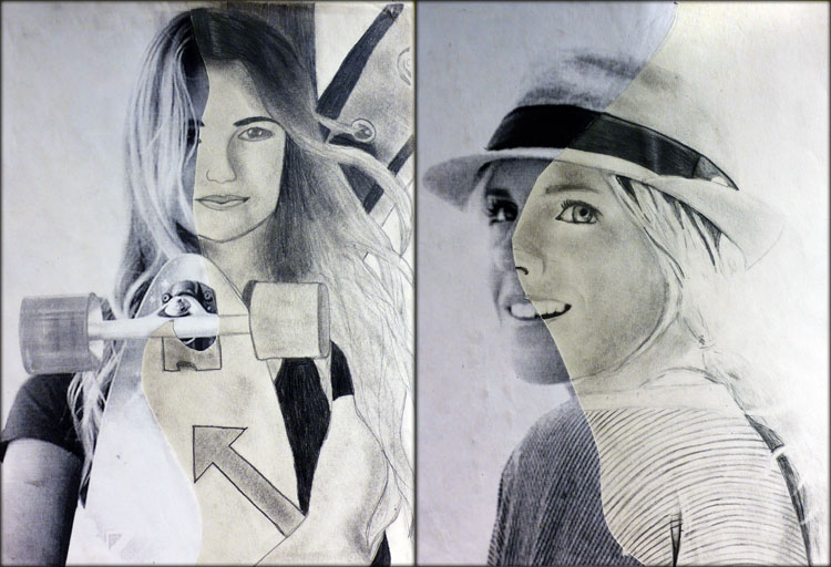
While many students searched through magazines to find an interesting or inspiring image, I provided photocopies of a few local Kauai surf heroes to choose from as well. Pictured above are Alana Blanchard and Leila Hurst, while the bottom images include Sebastian Zietz and Andy Irons. Other local surfing professionals included Dustin Barca, Bethany Hamilton, Malia Manuel and Evan Valiere.
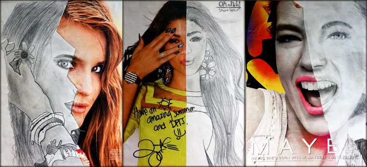
Students really seemed to enjoy this lesson, and several students chose to draw more than one. I may bring this lesson back in the future with a different photo inspiration, like a “selfie”!
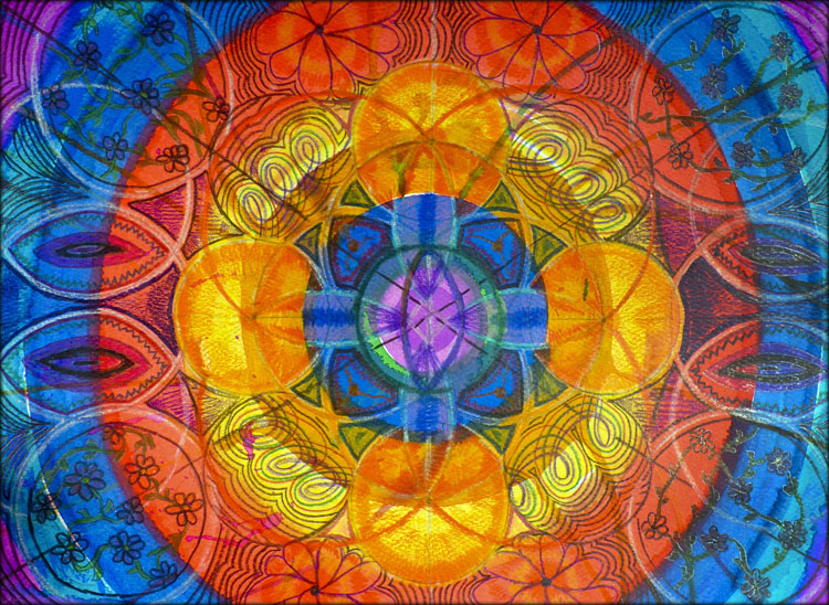
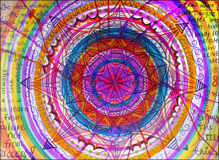
The first project of the 2014-2015 year for Kapa’a Middle School’s art students was to create a mandala design that would also be used for their sketchbook covers. This multimedia lesson served as an introduction to radial symmetry and repetition of line and shape.

The underlying colorful circles were created by brushing liquid watercolor onto a paper spinning on the pottery wheel. Although it isn’t clay, this gave students an opportunity to use their all-time favorite tool!
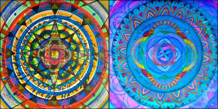
Starting from the center, bands of watercolor were applied until students reached the outer edge of the paper. Students also created interesting streak and drip affects by blowing the wet paint through a straw while the wheel was spinning.

Once the watercolor paint was dry, students used colored pencils to draw a mandala on top of the colorful background. Tools such as rulers, compasses, and circular objects helped to create accurate lines and spacing.
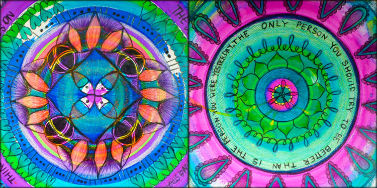
Students also enjoyed learning about the symbolism, history, and cultural practice of mandala creations. They were especially fascinated by Tibetan sand mandalas, and puzzled about why the artists would eventually destroy the intricate design they so painstakingly created.
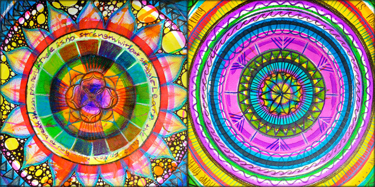
Finally, students incorporated inspirational quotes or affirmations to inspire them every time they look back on their mandala design.
