Creative Crushed Can Creations
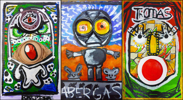
crushedcans_01

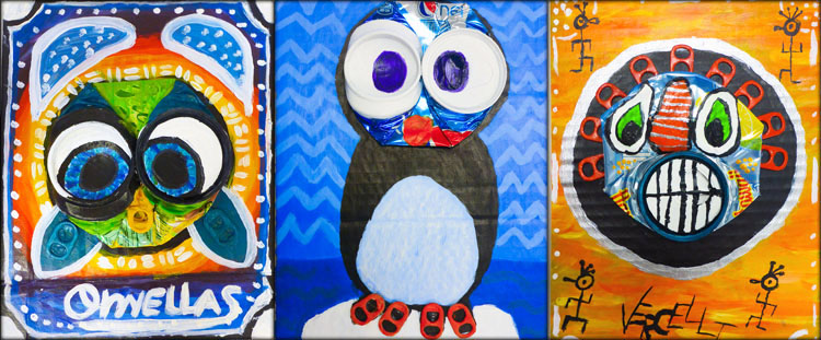
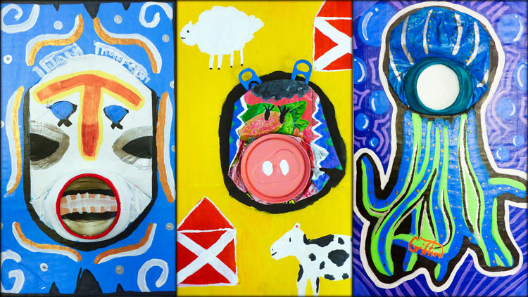
This year’s recycled art project involved smashing soda cans, reusing cardboard boxes and transforming the combined pieces into a unique work of art. Students explored the contemporary work of French artist Didier Triglia, before coming up with their own original designs based on his style and techniques.
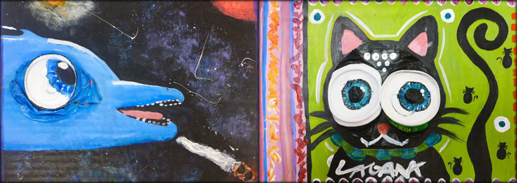
crushedcans_02

Lots of sketchbook work and planning helped students to envision how they might transform the irregular 3-dimensional form of a crushed soda can into something new. Next came their favorite part of smashing the cans! After my first period made a noisy racket, I got smart and required that students do the smashing part outside.
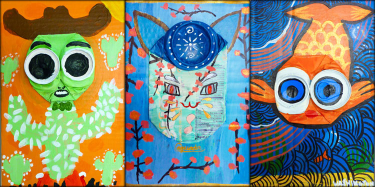
crushedcans_03

Some students chose to reveal parts of the original can label within their design, while others covered up all the aluminum with acrylic paint. Do you see where the can is in each composition?
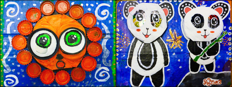
crushedcans_04

The background of each artwork includes heavy pattern, outlines and borders. Many students also incorporated extra can tabs, bottle caps and other recycled material.
crushedcans_05

An article titled 11 Artists Doing Amazing Things With Recycled Materials by Jill Harness complemented this lesson by exposing students to other styles, materials, and ideas.

crushedcans_06

Finally, we looked at portraiture from one of the most influential artists of the 20th Century- Pablo Picasso. Students readily identified stylistic comparisons between Didier Triglia’s “can heads” and Picasso’s stylized and abstract faces.
crushedcans_07

Acrylic Agamographs

agamograph_01

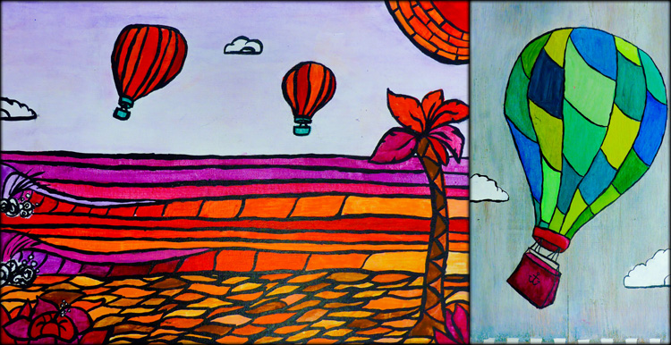
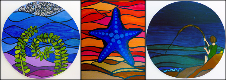
This year Kapaa Middle School Art students experimented with a variety of surfaces and display options for their paintings. While some students worked on canvas and wood for their ACRYLIC LANDSCAPES, others opted to create a 2-way painting called an Agamograph.

agamograph_02

The examples pictured here show 3 views of the same project:
– The center view shows two separate images converging.
– From the angled views on either side, the viewer sees only one image.
The complete composition comes to life only as the viewer physically moves from one side to the other.

agamograph_04

To accomplish this magical illusion, students first created two acrylic paintings on paper. The first painting was a stylized landscape using analogous colors, while the second included a close-up detail from the first landscape in a different analogous color scheme.

agamograph_05

Once the paintings were complete, students measured, numbered, and carefully cut both paintings into 2″ strips. The strips were then glued to an accordion folded board. While our final Agamographs became two-way paintings, instructions for a 3-way version can be found on the Art-Rageous website.

agamograph_06

Agamographs are named after Israeli artist, Yaacov Agam, who was a pioneer creator of the kinetic art movement. Students were intrigued by his large-scale sculptural work and abstract style. By following in Agam’s footsteps, students learned a new way to actively involve the viewer in their artwork.

agamograph_03

For anyone who might want to replicate this project, it can be accomplished with a variety of 2-dimensional media, including photography, ink drawings, colored pencil, or oil pastel to name a few. I recommend selecting a subject for each image that relates in some way or creates a duality. Visual contrast between the two images also enhances the transformative effect. Feedback is always welcome! Comment with any questions and let me know what you think!

Acrylic Landscape

landscape_01

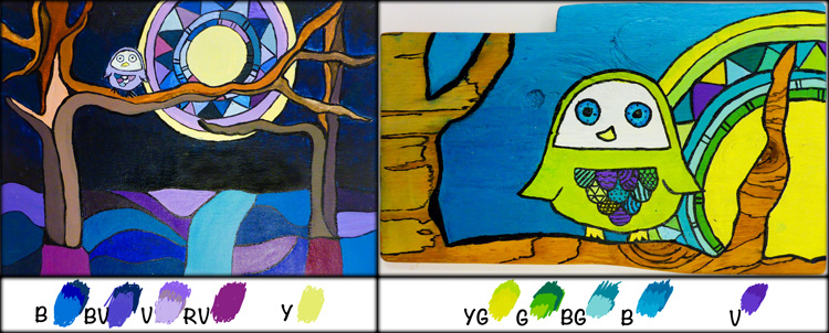
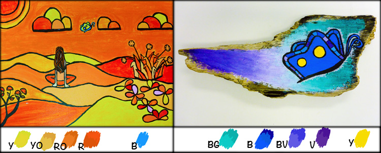
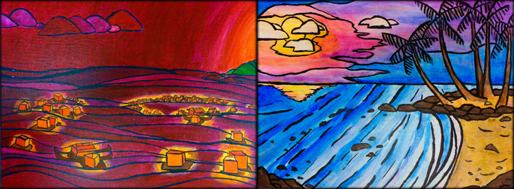
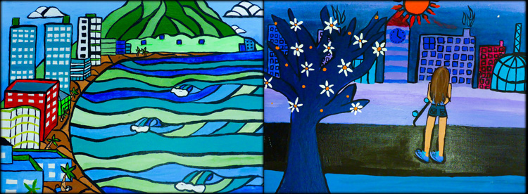
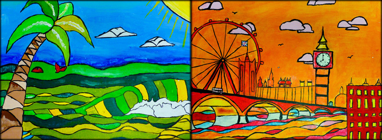
KMS Art students each created two acrylic paintings this Spring. The first painting was a landscape of their choice, while the second included a close-up view of one small detail selected from their original landscape. Each painting was designed with a different analogous color scheme that needn’t resemble real-life.

landscape_02

The paintings above and below demonstrate the analogous color study, which involved selecting a group of 4 colors adjacent to each other on the color wheel. Aside from one small highlight color outside of the analogous scheme, students were limited to this small range of hues to which they could tint, tone, and shade (creating value scales from dark to light by adding black, white, and gray).

landscape_09
Additionally, neutrals such as black, white, gray, and brown were used to accent the more vivid hues. The color scheme for this project required students to become very familiar with their color wheels, encouraged A LOT of paint mixing, and invited a unique perspective of the landscape.

landscape_03

Students were introduced to the work of artist, Heather Brown, who’s signature style includes simplified shapes, bold black outlines, and Hawaii’s local surf spots. Like Heather Brown, students simplified and stylized their landscape on 9 X 12″ canvas board.

landscape_04

Students were also inspired by Spencer Reynolds, who often paints seascapes on surfboards and driftwood. For the detail painting, students used acrylic paint on a scrap of wood. Some chose to leave part of the woodgrain exposed and unpainted to incorporate the texture and linear wood patterns within their design.

landscape_05

The landscapes students chose to paint ranged from their favorite spots on Kauai to far-off destinations that they hope to visit one day. Before settling on a design, students spent time researching various landscapes including urban environments, forests, mountains and beaches.

landscape_08

Analogous color schemes generally create serene and comfortable designs, are often found in nature, and are harmonious and pleasing to the eye. Students began with one dominant color, selecting 3 others on either side of the color wheel to support.

landscape_07

Painting guidelines for the landscape included:
1. Stylize, flatten and simplify shapes
2. Add extra details to the edges and corners for framing and interest
3. Use layering and scale to create a sense of depth
4. Include black outlines to separate many areas of color value

landscape_06

Cupcake Sweetness!

Colorful Cupcakes...

Sugar Mill Cupcake’s local business owner and KMS parent commissioned Kapaa Middle School Art students to create some artwork to decorate her store! This has been an ongoing side-project that several students chose to work on in their spare time and outside of class. Thank you, Westy, for providing my students with such a great opportunity to learn about the “business” side of Art, along with a fun experience painting something special!

Progress and inspiration...

Complement A Master

Students “complemented” a master painter by choosing to reproduce one of her/his most famous paintings using colors that are complementary (opposite on the color wheel) to the original. Advanced Art students were required to apply skills in a new context while learning to paint with acrylic on canvas. The original painting can be seen in the bottom left corner of each image, with the student’s complementary version behind.

Students followed several steps in a lengthy process before achieving their final results. They began with research, preliminary sketches, color wheel painting, and measuring a proportionate grid. They worked closely with their sketchbooks throughout the painting process, referring to their notes, sketches, and color wheel.

Once the paintings were complete, students wrote an Artist Statement reflecting on the process, and comparing their final complementary painting with the original “master.” View a sample here!

I’m so proud of my students for their hard work and great effort! More samples of Complement A Master paintings are currently on view in the KMS office and G-101 Art Room display cases!

Collaborative Circle Paintings

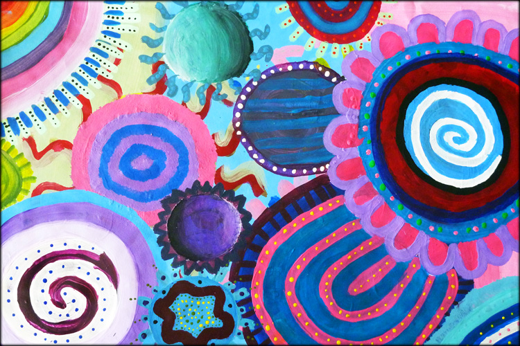
Beginning Art students at Kapaa Middle School worked with Acrylic Paints as they investigated color-mixing, layering, radial design , and a collaborative work environment. Once each student had established a background wash and a few circle designs, they were instructed to move about the room to music. Every time the song changed, they would move to a new location and another painting!

Students created colorful circles on one-another’s paintings while also forming a “circle of trust” and a foundation for a supportive and respectful classroom environment. In the end, each student completed the final touches and details on her/his own painting.

Menehune Food Mart Mural

Kapaa Middle School Art students were invited to share their creative talents as part of a “store makeover” at our local neighborhood Menehune Food Mart. We partnered with graphic designer Jackie Kanna through Life’s Choices anti-drug office. Our goal was to express a positive community-friendly message and make a healthy anti-drug proclamation to Kauai’s youth. Click here to view the press release issued by Mayor Carvalho’s office.

Derek Kawakami, State House Representative and part store-owner, jumped in right next to the kids and added his own artistic contribution!

Current statistics report that on average, boys living on Kauai drink alcohol for the first time at age 11 and girls at age 13. More shocking, Kauai County has the highest amount of alcohol-dependant and alcohol-abusing 8th graders in the state. As part of this mural project, all of the students and adults who participated took a pledge for healthy and age-appropriate use of alcohol and sealed it with a hand-print on the wall.

The day concluded with a “store-reopening” ceremony, including speeches by our state senator, county officials and the school district superintendent. There was also a traditional Hawaiian blessing plus lots of media coverage. Please come by when passing through Kapahi and check it out in person!

Scroll through the full mural below…