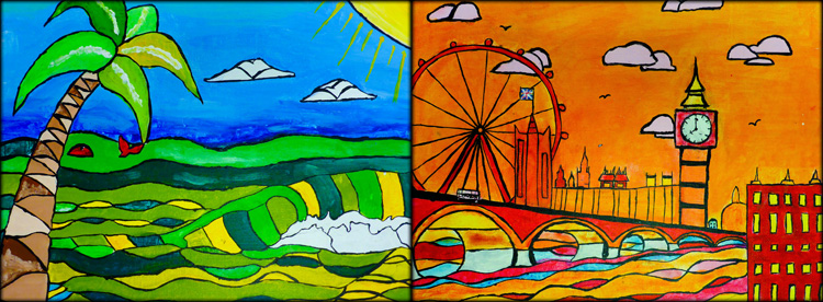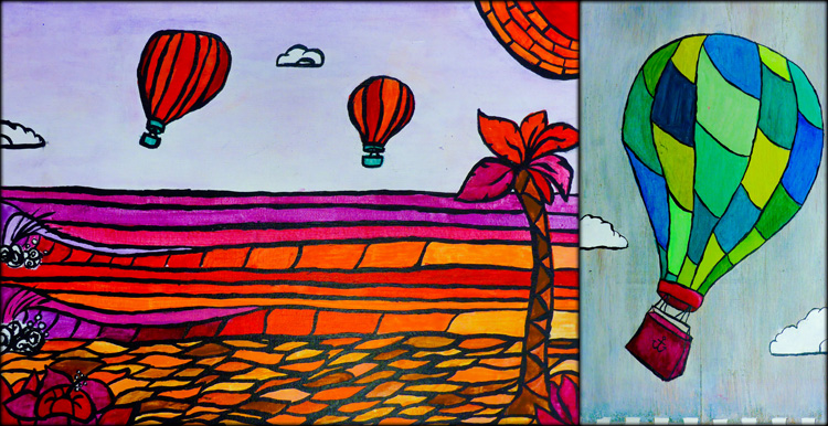
KMS Art students each created two acrylic paintings this Spring. The first painting was a landscape of their choice, while the second included a close-up view of one small detail selected from their original landscape. Each painting was designed with a different analogous color scheme that needn’t resemble real-life.
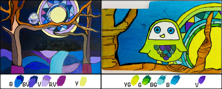
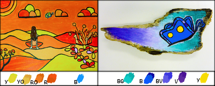
The paintings above and below demonstrate the analogous color study, which involved selecting a group of 4 colors adjacent to each other on the color wheel. Aside from one small highlight color outside of the analogous scheme, students were limited to this small range of hues to which they could tint, tone, and shade (creating value scales from dark to light by adding black, white, and gray).

Additionally, neutrals such as black, white, gray, and brown were used to accent the more vivid hues. The color scheme for this project required students to become very familiar with their color wheels, encouraged A LOT of paint mixing, and invited a unique perspective of the landscape.
Students were introduced to the work of artist, Heather Brown, who’s signature style includes simplified shapes, bold black outlines, and Hawaii’s local surf spots. Like Heather Brown, students simplified and stylized their landscape on 9 X 12″ canvas board.
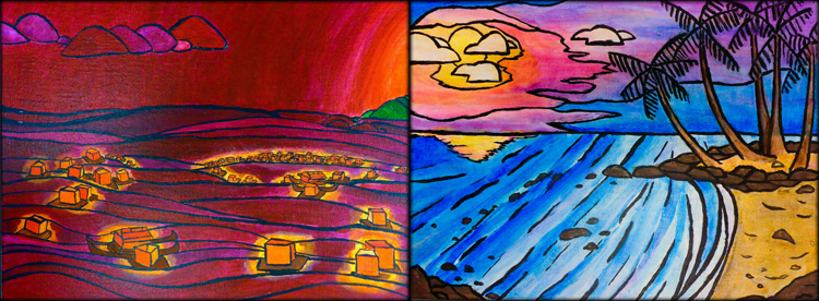
Students were also inspired by Spencer Reynolds, who often paints seascapes on surfboards and driftwood. For the detail painting, students used acrylic paint on a scrap of wood. Some chose to leave part of the woodgrain exposed and unpainted to incorporate the texture and linear wood patterns within their design.
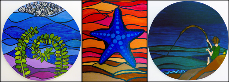
The landscapes students chose to paint ranged from their favorite spots on Kauai to far-off destinations that they hope to visit one day. Before settling on a design, students spent time researching various landscapes including urban environments, forests, mountains and beaches.
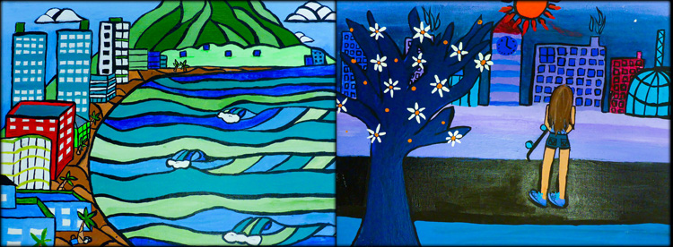
Analogous color schemes generally create serene and comfortable designs, are often found in nature, and are harmonious and pleasing to the eye. Students began with one dominant color, selecting 3 others on either side of the color wheel to support.

Painting guidelines for the landscape included:
1. Stylize, flatten and simplify shapes
2. Add extra details to the edges and corners for framing and interest
3. Use layering and scale to create a sense of depth
4. Include black outlines to separate many areas of color value
